WELCOME!
Uh, yeah G’DAY! Tis me… Bush Babe of Granite Glen.
WELCOME!
I’m moving house… it’s kind of scary and exciting and paralysing and awesome and terrifying at the same time. I hope you will all have a good explore around the corners and crevices of my new blog. I haven’t quite finished the job of course – there are a few boxes left unpacked and I keep getting the feeling I have left the cat behind (Middy? You there somewhere?). But it’s time to unveil this new look, and gather some feedback.
I have tried to keep most of it familiar feeling:
- a dark background
- most of the old posts
- same style of banner (like the sparkles? Just learned how to do that! Will share soon.)
- same blog followers* device (gosh I hate *that term – you ride BESIDE me here, not behind!)
- twitter stream
– while adding some improvements:
- a general clean-up of the sidebar
- groovy ‘magaziney’ style front page
- easy-access to your favourite Bush Babe ‘flavour’ in the link bar below the header – Food, Horses, Language, The Bush, Weather (the rest is called General Yarns)
- if you are only interested in one ‘flavour’ you can now subscribe to it (rather than having to trawl through the rest of my deluge of posts)
- easy-to-view previews of the last NINE posts (the four most recent in the sliding header at the top, five previous to that in previews below)
- I made the background slightly lighter than black – hopefully easier for y’all to read text on. (Let me know if that works!)
- There is a Shop area which I will add to with freebies and items for purchase
- A Rogues Gallery for those not quite sure of the main characters of Granite Glen
- Causes to see what pushes my buttons, and why
- Some blather about me (boring but apparently necessary)
- And archives to find something in particular
Things to note:
- I MUST acknowledge the amazing patience of the person I finally handed over my new-look blog to for ‘tweaking’: Conor of WPKickStart. The man is a saint. I knew what I wanted but had NO idea how to get there. Thanks man. You rock!
- This blog is still a work in progress – all constructive advice warmly welcomed. (That *thud* you heard is Conor diving under the desk!)
- I have not been able to transfer comments from the last few months blog posts over (if anyone knows how, please share!)
- I am still learning how to drive WordPress as a blog editor. Bear with me. I am a dolt when it comes to learning new internety things.
- I also need to acknowledge help and general support from my friend Gem and my sister Jeanie. Thanks girls. *chink*
I fervently hope that all my wonderful readers (that’s YOU) soon feel as ‘at home’ here as you did my last place of residence (back here). I understand that will take a little while for some (I vaguely recall when PW changed her site – I think I sulked for a week!). I shall be leaving my old blog sitting there for a little while – mostly because I have no intention of individually transferring all the links to my new blog from my old posts. (Have I any idea what I am talking about? Probably not…)
So there you go… except of course, I hope you don’t. (GO that is!). I am feeling a little vulnerable here… explaining something to you in one post that’s taken about five months to get explained (and sorted) to me! Did you get lost anywhere there? I look forward to hearing from you soon with your first impressions/questions/smacks on the wrist…
🙂
BB
18 Comments
Heather
Way to go!!
What a big step.
I love it. Very sleek and cool.
I will follow you here too.
Don’t know about the grey back though…. I’m used to the black! I’ll get over it, though. Maybe.
CeeCee
Well, I can’t decide how I feel about it yet. It takes me some time. I carried on for days when my hubby got a new remote control when the old one worked just fine.
The only thing I see that I would change is the BlogHer ad at the top. The Tropicana ad takes away from your blog post. Any way to move the BlogHer thingy down the page a bit?
Love the fonts, header and color scheme.
JENNY TALIA
Look at YOOOOOU, fancy pants!!
Love, love, LOVE IT!
Well done BB
It’s very flash
Should I have wiped my feet before I came in?
Did I say I loved it??
‘Cause I do !!!!!!!
JT
x
(OMG – AM I your first??….hoooly doooly!!)
Patches
Congratulations! The new site looks lovely! I like the “magaziney” feel to it. Looks very classy and professional! Can’t even think of any suggestions for it, it looks fab!
UtahZen
LOVE IT!!!!!! It’s so great BB! Very pretty, functional and fun! And i love the sparkles 🙂
Mikey
I like it!!! Bookmarking now!
Bush Babe
Thanks Mikey – didn’t realise comments would be moderated… aaaakkkk! This new horse is not QUITE as smooth as I would have liked. 🙂 BB
jeanie
Woo hoo – I am the first to say love your new look – will take a bit to get used to the “where to click” on the front page, but subscribing now!
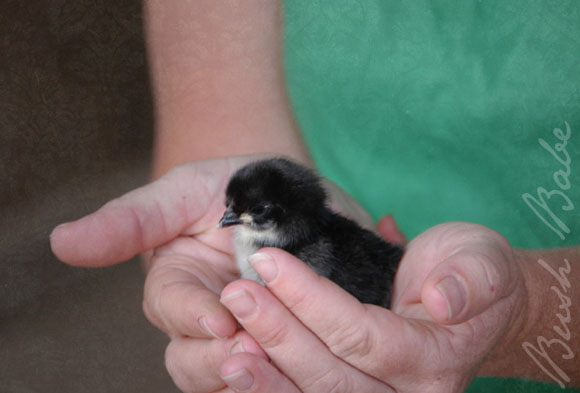
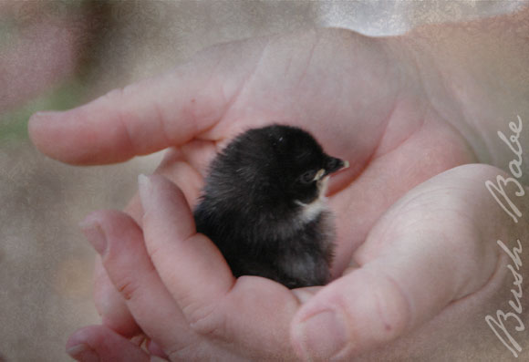
‘Salina wants to know what sort of bird and who is holding it in the last shot (we have just had a discussion regarding whose hands…)
Tracey
Wow!!!! Love it! And it’s even better than building a new house, because if you don’t like the paint, or the colour of the carpet, you can just change it!!
Feedback? (Don’t forget I love it, most impressed – and of course I’ll ride with you!!) Here are the few things I’d change if I was let loose:
Funny how I used to think black background was a bit too much contrast, but now I’m thinking the grey in the post area maybe needs to go a shade darker. (Maybe the same ‘black’ as your background – which I think isn’t full-on black. (Thinking it’s a #222222 instead of a #000000??).
I’m in two minds about the centering of your text. When it’s only a line or two in between photos, centred looks best. But when it’s a longer paragraph, left justified looks better.
I wouldn’t have your top section automatically changing – bit of a pet hate actually. I always get a bit flustered when things move or change when I’m in the middle of reading, or looking at a photo or something. (Or you look away for a tick, then you look back and the thing you were about to click on has bloody changed!) I like the idea that you can see those thumbnails of the latest few posts and then choose for them to come up on the main screen, but I think it should be a manual change with either a rollover, hover or click. (The powderroomgraffiti.com site has a compromise version of this now after their first prototype on their website makeover was doing the same thing. At least now it’s got a pause button.)
Maybe the next sections down need a header so we know what category those posts come under. Like.. um.. well, what are those posts… not the most recent… are they Top Recent.. or what?
There’s something going on when you click on your menu items (ie. food, general yarns, etc). They are showing in a cursive font, but then when you click on one and that page is loading, the same items show up in your normal text font, and lower down. Then when the page loads it switches back up to the cursive.
I’ve got to run now (canteen at the school, blah!)… but I’ll be back later to wander around. I actually haven’t seen it all yet. Think I’m going to need a whole weekend!!!
Jayne
Fabulous!
I’ve been wondering when you’d do this as if anyone should have their own ‘spot’ it’s definitely YOU.
And it’s marvellous!
Sally
I love the new site!!
It’s so clean and lovely.
Will definitely be following you on here 😀
Bush Babe
Thanks so much Sally – I have been so nervous!!! Glad you like the new look… make sure you test it properly and let me know any hitches.
🙂
BB
Tamsyn
Love, Love, Love It!! It’s so new and shiny, yet still undeniably you 🙂
gem
BB – Love it – awesome. It is a credit to you to see you moving up in the world of blogging. You still inspire me everyday in my photos even though I don’t have much time to do much with them at present (6 wombats and a possum take a little of my time at the moment!!!)
I am trying to set up a new wildlife blog and keep thinking – tooo hard. So what you have done here is inspiring me to keep going – thanks love!
Pony Girl
Looks so great BB! It’s always hard to get used to new blog designs- for both the blogger and the reader. I think it’s different enough, yet not too drastic- it’s still you. I will say I’m always a little sad when I see someone’s blog change TOO much. Some of the home decor blogs I like to read have gone a little too “commercial” and are all starting to look a like. Then their own good personal content dwindles and the blog becomes nothing but features on all their “sponsors” and links to purchase from them, then I just stop visiting. 🙁
Have a fabulous weekend!! xo
Suze
I came over for a visit and I like the new pad Bush Babe!!!!
gina
Wow, where have I been? I guess to busy. Just finding out about your new place and looking forward to looking around. Congrats on the new cyber home!! 🙂
diane
me likey me likey!